

Welcome to MFL 2.0
A new chapter, with the interface rebuilt from the ground up.
When we set out to redesign MFL, we didn't want a coat of paint. We wanted the next version to actually feel like the next version: clearer, faster, more itself.
Today, that version goes live. MFL 2.0.
Why a 2.0?
MFL has grown a lot. New features, a new design identity, new flows, all built on top of an interface that wasn't designed for everything we've become. The seams were starting to show. Pages that used to be enough were no longer enough. Navigation that worked at one scale was creaking at the next.
So we rebuilt it. A full overhaul of the product's language: layout, design system, navigation, content, modals and pages, aligned with the brand we relaunched last year and ready for the years ahead.

The principle we worked to: every page, every component, every piece of data should sit in the place you'd actually go looking for it. Stuff is in the correct place, not just "why not put it there."
For those who like numbers:
- ~3,000 files touched
- ~1,000 new files
- ~530 redesigned UI components
- ~70 modals rebuilt or replaced
- ~50,000 new lines of code
The numbers are just the backdrop. What matters is what they let us ship.
A new foundation
What you don't see is just as important as what you do. The whole layout (desktop, mobile, top bar, body) has been rebuilt, along with the club selector, the user profile banner, and countdowns. The skeleton of the app is new. That foundation is what makes everything above feel coherent. And it's what makes everything we ship next easier. Many pages and sections were placed where they could fit. Now, they are where they should be. View your agency in My Players. Your club holdings in My Clubs. It may take a while getting used to it – but it'll be worth it.
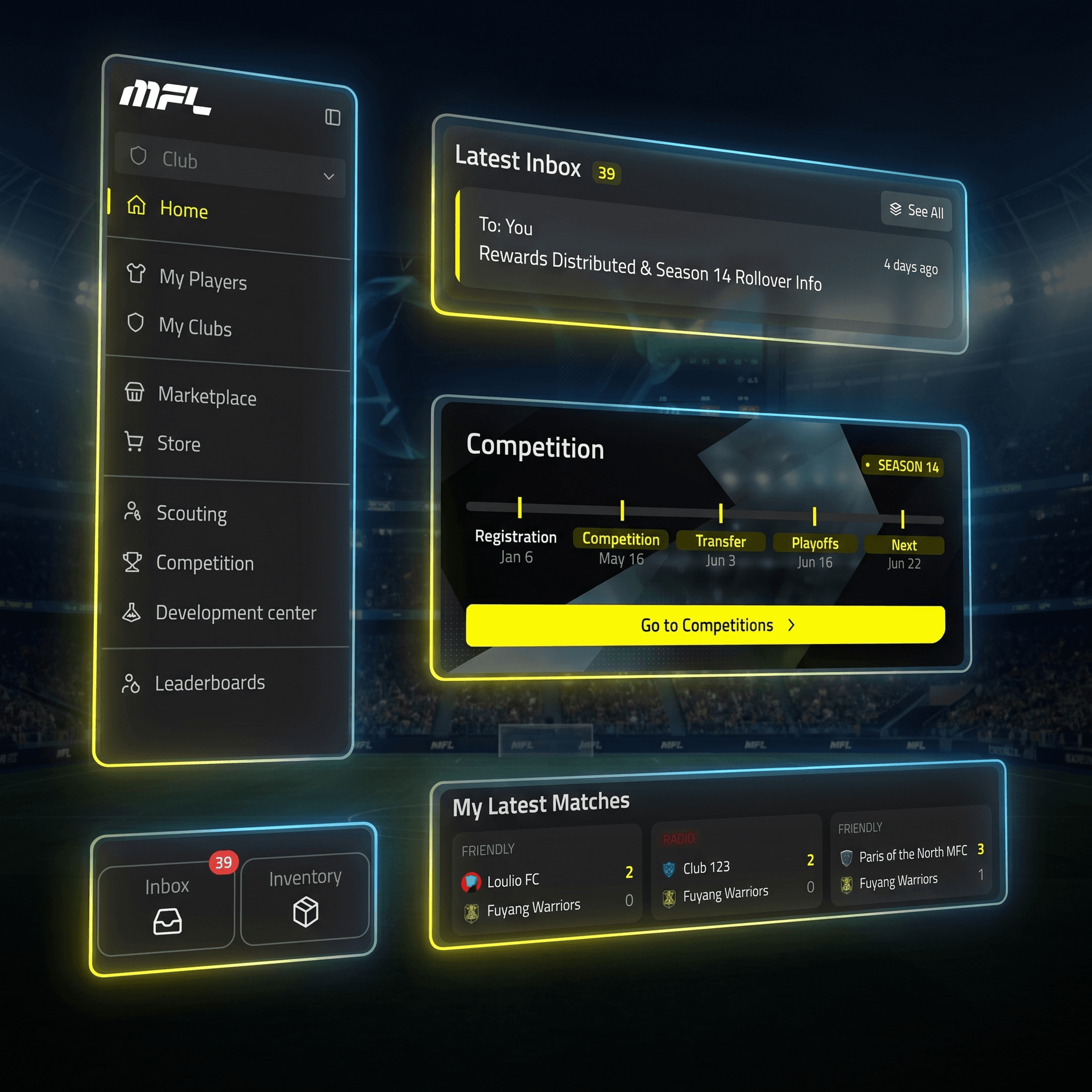
A new homepage
The homepage is the front door. We rebuilt it from scratch.
Logged out, you arrive at a story: a hero, a clear pitch, a path to the community. Logged in, you arrive at your MFL. A view of where you stand, what's moving, and what you should be focusing on right now.

A global search bar
Find anything in MFL in seconds. Players, clubs, competitions, pages. All from one bar in the top nav.
More history, more context
MFL has been running long enough that the game now has real history. We've made sure you can actually look at it.
- A History section for every Season, with every past edition and every winner.
- A History tab on every Club, with a clear view of the ups and downs.
- A History tab on every Player, with their full career arc visible at a glance.
The longer you play, the more this matters. Now there's somewhere to feel it.

Plus a lot more
Things that didn't earn their own section but earn their own keep:
- Smoother mobile navigation. A new bottom bar menu makes getting around fast and natural on mobile.
- Live Match, redesigned. Redrawn header, mobile-friendly tab selector, stats and event cards aligned with the new design system. Watching matches now feels like watching matches.
- A new-look Competitions page. Seasons now have a proper home with a hero banner, an easy way to register, plus a timeline widget so you don't miss what's running.
- Tactics, one click away. Set tactics for an upcoming match straight from the homepage or your club's schedule.
- A progression feed on player pages. See exactly when each attribute was gained, not just the latest values.
- Richer club previews. The preview modal now packs a lot more information about every club.
- User profile pages, revamped. Prettier, more complete, with achievement badges properly on display.
- A smoother Development Center. Send players straight from there, without the redirect detour.
- Live streams, surfaced. A button right in the top bar, with a preview on hover so you don't have to go looking.
- More native sharing. You can now share an image of your player's progression updates, on top of all the images you could already generate.
- A smarter anti-spoil system. Match results and standings stay hidden until you want to see them.
- Better-looking tables, with a compact mode. Every data table got a redesign, and you can flip to compact mode when you want more density on screen.
That's not all, though. There's honestly so much more to it. Quality of life improvements. Redesigns. We can't wait for you to discover all of the changes!

If you've been here a while
Some pages have moved. A few have merged into cleaner tab-based navigation. Nothing important has been removed, but a lot has been rearranged for clarity. And a lot has been added. If you can't find something, the new global search bar will get you there. If anything feels off, tell us.
What's next
The new system is built to grow with the game, and we have a lot in motion. New features will feel more like MFL than ever, because the foundation is more solid than ever. For now: jump in, click around, look at every screen with fresh eyes. Then tell us what you think, in Discord, on Twitter, wherever you reach us.
Welcome to MFL 2.0.
Share this article